Color Thesis Proposal
A Research Proposal for a Correlation between Colors and Desire.
Color. It forms the backbone of what most of us see. The fact that color can make us feel things, can make our eyes shoot from here to there, and even to have hidden meanings and correlations is a phenomenon we have yet to truly understand.
This program was developed to aid an undergraduate psychology and neurobiology student with their research proposal. This proposal describes a potential subconscious association between music as well as musical concepts and colors. It established a table with 60 “participants” who, when shown snippets of music from various genres, marked a color that came to mind. Then, using Python 3.12 and a few libraries, this data was compiled and sent to me for analysis.
Procedures
In this sector, we will analyze and break down the Procedures used in creating this program, alongside getting a sense for the types of data structures and programming conventions used in this program. This program uses Object Oriented Programming principles, and is made to have a more readable experience, leading to an ability for expansion in the future if necessary.
Prototyping
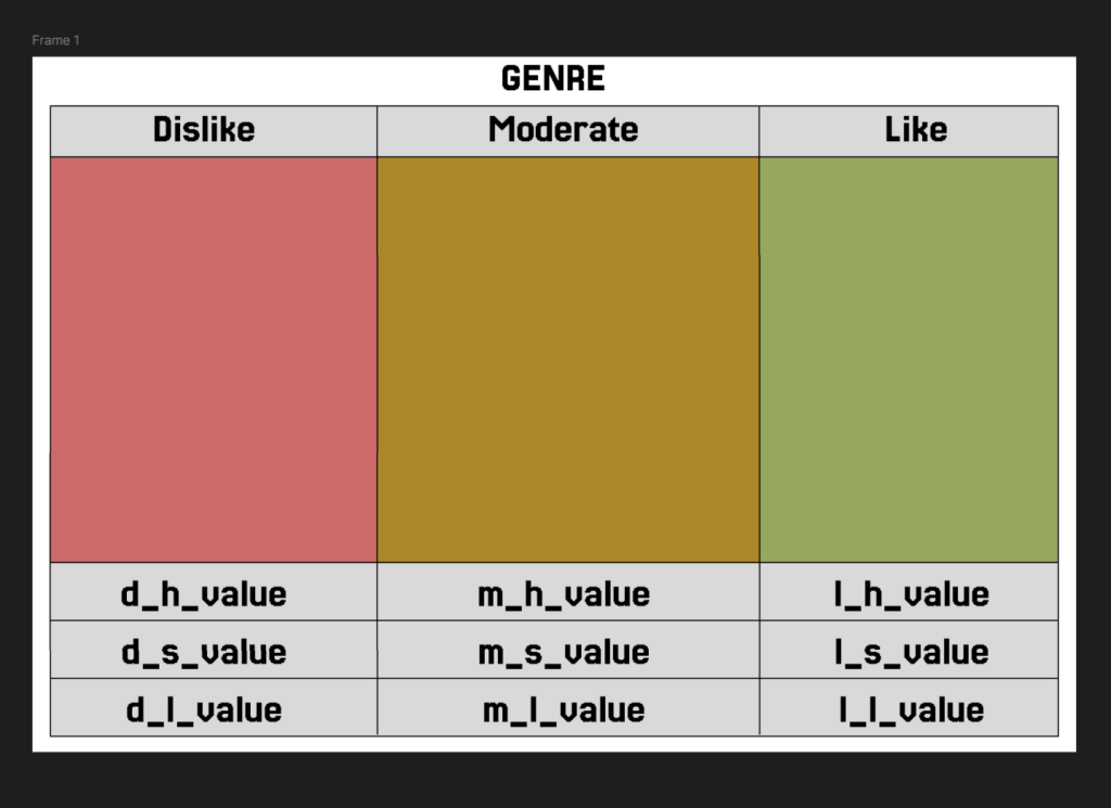
Initially, the researcher and I spoke about their desired figures, and they sketched an idea to me on paper. From here, I created a render in Figma, and showed it to them. Upon approval, I began thinking about what libraries to use and how I could create a good render of their desired product.

After a while of thinking, I decided to use my limited experience in Tkinter as an opportunity to further learn about tkinter. This library is normally used for GUIs, so I knew it would be an interesting use but I’ll never say no to a challenge. Then for the requested scatterplots, I went with one of the other most popular libraries in python for data visualization, Matplotlib. This graphing library would certainly come in handy for creating a scatterplot to the desired specifications of the researcher.
Data Cleaning
Upon receiving their csv, I took all the data and removed any extraneous data on the bottom of the csv by taking the head(60) of the dataframe. Luckily, the data was already mostly clean as there were no null values or any extreme values as any and all values are important in this stage. This gave me all 60 participants’ data, and allowed me to move onto the next step, storing the information.
Data Warehousing
To store the cleaned data, I dissected the dataframe into Genre(self, name, h_value, s_value, l_value) objects which in themselves reunited their hsl values into a dataframe titled dataframe. This gave me a Genre object that was not only isolated h/s/l values, but also could be showcased as a whole dataframe. Due to the smaller nature of this in the current state, I had no fear of the amount of dataframe variables in every Genre object due to the fact that these items were one string, three serieses (pandas equivalent to a list), and one dataframe. In future iterations, I would consider removing the dataframe variable and creating a new dataframe upon use, removing one more variable from memory and improving efficiency. Continuing on, the Data object is created, which holds variables from d/m/l_color (dislike, moderate, and like respectively), as well as the d/m/l_h/s/l_value variables which are float representations of their namesakes’ averages. This data class is used to generate the LikenessCards with more efficency, and acts as a separate place to process the data so as to not clutter the LikenessCards.py file.
Data Visualization
In files LikenessCards.py and PointsFigure, the aforementioned objects are used to create visual interpretations of the data which create a better method of understanding for not only researchers, but also the average person attempting to understand the data being expressed. We can use these figures to draw conclusions on data more easily, as numbers can get to be confusing after a long while.
Results
Use
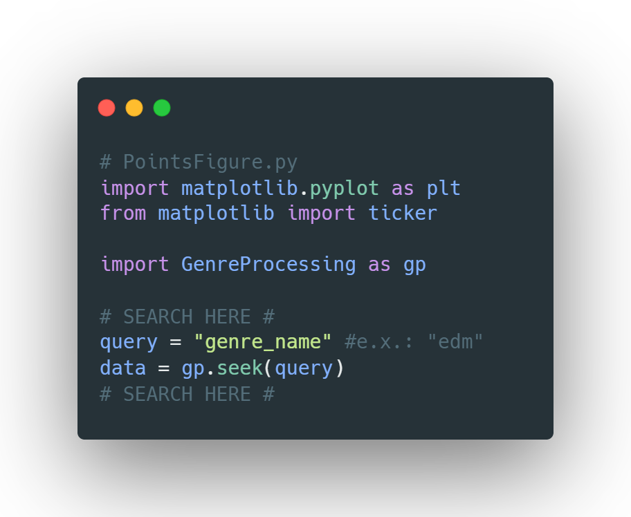
This program has no initial user interface, nor a main class as it is made to be as lightweight as can be for the sake of ease. The query variables in both Visualization classes are the main dictators for what will be generated, as querying something like query("edm") will lead to a visualization of the data in attributes "h_edm", "s_edm", "l_edm", and "ln_edm".

HSL Plots
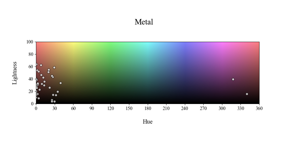
Items for the HSL plots are placed on a color spectrum, wherein items are plotted with the formula x = h_value and y = l_value. This is due to the fact that on the color spectrum, hue represents a value between 0->360, ranging from red hues to the violet end of the spectrum. Thus, in this visualization, we take the h and L values and overlay them on a grid representative of the color spectrum.
Likeness Figures
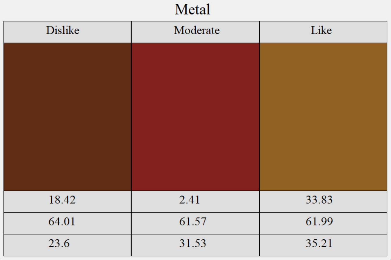
The Likeness Cards are a form of showcasing the relationship between [genre]_{h/s/l} and [genre]_ln. By being able to not only see the values for the queried genre, but the shade resulting by the averaged values separated by independent variable: likeness, we are able to better see if there is a vast variance in the colors based on likeness. This leads to a better opportunity to make a conclusion on whether likeness is statistically significant or not.
Example of Figures : Metal


